Visualizing Hive NYC – Part 2

This past Spring, members of Hive Research Lab worked with students in Indiana University’s IVMOOC, an online information visualization course, to take data about Hive NYC-funded projects and partnerships and see what sorts of interesting patterns might emerge through different visualization techniques. In this two part series, we interview each of the two teams of students  that worked with the data to have them share their process, the visualizations they came up with, and reflections on what it was like working with Hive NYC data.

One qualification to note: as the data these visualizations was based on were sometimes incomplete and also self-reported, these should be treated more like prototypes for how we might represent Hive activity, rather than definitive statements of what activity has been.

In this post, we talked with Team EsHkUsNl, made up of Gloria Jimenez, Elwin Koster, Maria Maza, Carmen Ng, Chantal Melser and Kristina Simacek.

Hive Research Lab (HRL): Tell us a bit about your approach to visualizing Hive NYC. What kind of process did the team go through?

Team EsHkUsNl (TE): With an international team spanning the globe, we were challenged to collaborate across different time zones and to learn and draw on each other’s strengths.  Using social media, including Google+ hangouts, we were able to facilitate regular collaboration. We were inspired by the fun of doing an online course, and as we progressed in the project it became more of a professional endeavor.

As for the work itself, we approached the project through extensive discussion and sharing of different approaches to visualizations, providing examples from each of our backgrounds and trying to pick out the main elements from each visualization to put together a final visualization that took into account both our desire for a clear and useful visualization as well as balancing the limitations of the data.  In analyzing the data, we went through several iterations of visualizations to determine what would best represent the data in a useful way. Each visualization is a multi-layered process, and in the final visualization we attempted to show multiple layers at the same time so that both an overview of the data and specific elements of the data could be shown at once.

We appreciated having the flexibility to come up with what we thought was important to show to key stakeholders, including administrators, donors, organizations, and youth.  This allowed us to think freely about what we wanted to show, and experiment with different kinds of data visualizations.

HRL: Let’s have a look at the visualizations that the team produced. What do you think they show about Hive NYC?

TE: Here’s the first visualization we came up with:

Hive NYC TreeMap

Tree Map of the Hive

First, we tried a tree map to highlight how much financial resources were going into different grant categories. This revealed the dollars split down into project and partner organizations. Clearly, the Catalyst grants receive the most money, the Link and Lever grants have less weight in this.

Hive network

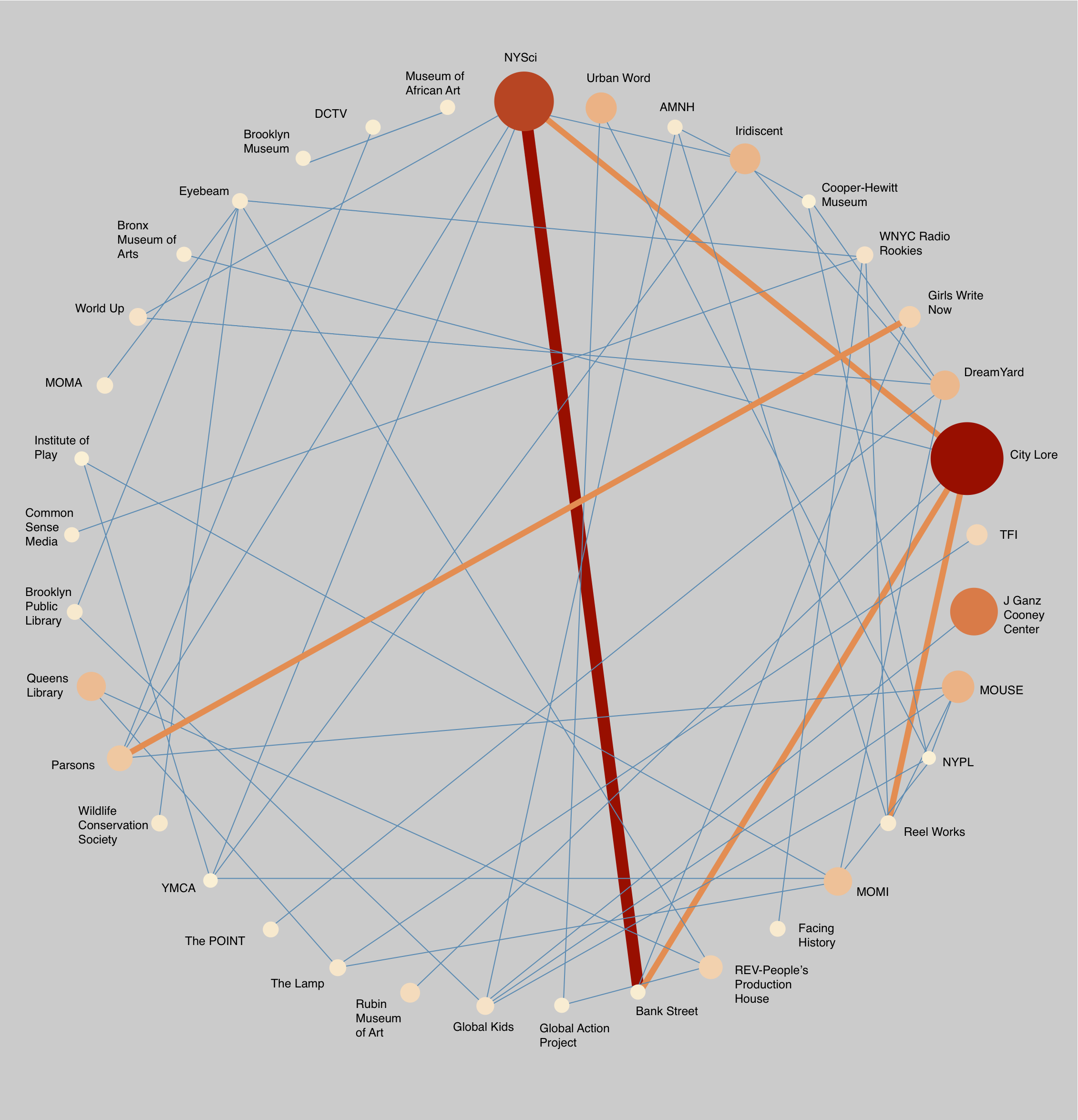
Network Visualization of Hive NYC

Next, we explored a circular network diagram, in order to be able to see the connections between organizations and incorporate the amount of dollars involved by position in the circle. 12-o’clock is highest amount of dollars, then clockwise the amount of dollars decreases. The nodes are sized and colored by the number of youth reached. We realize some of that is sort of skewed though since there were some apples to oranges issues with the youth reached data, as some were counting large online audiences with limited engagement, and others smaller groups with more intensive engagement. We realized that visualizing “impact” in this way can be a little bit of a challenge in terms of telling the story of what’s actually going on in these programs.

circos hive ok white

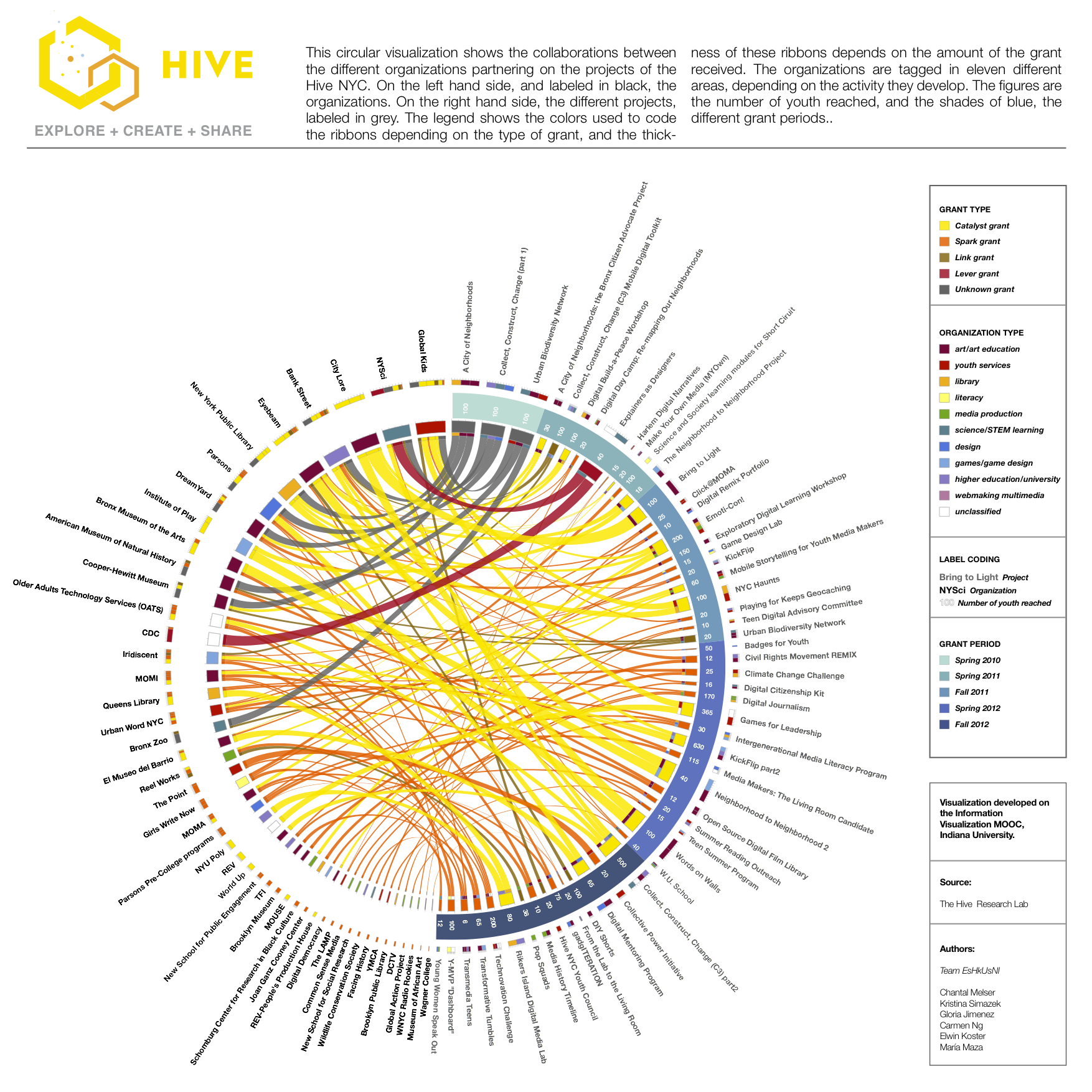
Bipartite Circular Visualization of Hive NYC

For our final visualization, we decided to use a tool called Circos, which places network data in a circular map. With this tool, it is possible to order nodes, select colors for edges, and indicate sizes of edges.

The Circos approach enabled us to place each project in order of season during which the grant was awarded, and to color-code linkages by award type, while sizing linkages by award amount. In cases where multiple groups were involved in the project, the award amount was split among the participating organizations to sum to a total for each project. This approach also minimizes the impact of outliers while allowing for a quick overview of the network with the possibility of zooming in or out to see specific information.

Colors of the “ribbons” in the visualization represent the type of grant awarded to the project. The type of grant is particularly interesting because it delineates the amount of money available and the expected size and scope of the project. Knowing this is important when comparing the relative impact of different projects. For example, a Spark grant is for up to $25,000 to explore a new idea or new direction for one or more organizations, while a Catalyst grant is for two or more organizations to develop a prototype/pilot program at a cost of $25,000 to $100,000.

We think that the visualizations that our team produced show the diversity of projects within Hive NYC.  This diversity in themes and types of organizations involved yields potentially wide-reaching impacts to a number of youth.  We can see from the visualization the variety of types of projects in which each organization is involved through their participation in Hive NYC.

HRL: Visualization is no easy task. Based on what you all learned through IVMOOC, what would you say are the potentials, but also the limitations, of using data visualization techniques to understand a context like Hive NYC?

TE: A widespread saying goes that an image is worth a thousand words.  Yet, it is also easy to lie with images.  In showing data within a data visualization one must be aware of what one is showing and how, as well as how it may be interpreted in different cultures.  This can make creating a data visualization quite complex. A limitation we ran across, and which would be an issue in any data visualization project is the question of what to show and what to leave out.  Particularly as data sets get larger and include more types of information, the question of what parts of the data to highlight and how becomes paramount.  In this way the potential to hone in on important themes in the data is great, yet there is always some loss of data in order to keep the data visualization from becoming cluttered and confusing.  This makes interactive visualizations particularly useful, as parts of the data set can be highlighted at different times.  Yet, interactive visualizations are also limiting because they cannot be used, for example, in print.  Furthermore, creating interactive visualizations requires highly specialized skills that may not be available.

Data visualizations can allow for presentation of what might otherwise be dry statistical information into a format that can be interpreted by a wider audience.  “The brain doesn’t just process information that comes through the eye. It also creates mental visual images that allow us to reason and plan actions that facilitate survival.” [A.Cairo, The Functional Art (2013), p. xvi]. In this way, and based on this citation we should see the data visualization as a new way to communicate data in a way that fits with the more modern ways of communication.

HRL: You all have largely been doing this work sort of in isolation of actually interacting with folks from Hive NYC, but now you’re getting a chance to talk to the network directly. Any general reflections you’d like to share?

TE: One point we struggled with in visualizing the Hive NYC data was how to show the impact of the projects on youth so that stakeholders can see how effectively their dollars are being used.  This must be understood also in the context of the types of grants offered by the Hive Digital Media Learning Fund, as some are intended to fund pilot projects, while others aim to substantially expand existing or previously piloted projects. In this way, data visualization can be used as an instrument to inform potential donors as to how their donation can make a difference in the lives of youth.

As a team working on a graphical representation of data we have clearly learned the value of such kind of visualizations in modern society, and we definitely believe it might be valuable for the Hive NYC to provide more opportunity think understand and create visualizations. Not only for the youth, and also for the organizations involved.

HRL: As some of you might know, part of our mandate at Hive Research Lab is to show how data and research can be used to advance the practice of Hive as well as communicate its activity to broad stakeholders. How do you think the work you all have done here helps to build a case for the utility of research for practitioners?

TE: We believe, as we said in our answer above, that using this way of visualizations as an instrument to inform both the stakeholders and the participants is a very powerful tool. Making the right combinations in your visualizations, in addition to displaying direct impact of funding on projects and youth, may show unexpected links that can trigger both the organizations as well as the funders to think of new projects and new directions.  Visualizations are a useful way to make a strong case for the success and challenges of implementing programs such as those in Hive NYC.

HRL: Thanks so much for sharing your perspectives, and for providing some new ways of making the activity of Hive NYC visible!

TE: You’re very welcome!

Visualizing Hive NYC – Part 1

This past Spring, members of Hive Research Lab worked with students in Indiana University’s IVMOOC, an online information visualization course, to take data about Hive-funded projects and partnerships and see what sorts of interesting patterns might emerge through various visualization techniques. In this two part series, we interview each of the two teams of students that worked with the data to have them share their process, the visualizations they came up with, and reflections on what it was like working with Hive NYC data.

One qualification to note: as the data these visualizations was based on were sometimes incomplete and also self-reported, these should be treated more like prototypes for how we might represent Hive activity, rather than definitive statements of what activity has been.

In the first post of this two part series, we spoke with Team Buzz Buzz, made up of Simon Duff, Camaal Moten, John Patterson, Ann Priestley and Sarah Webber.

Hive Research Lab (HRL): Tell us a bit about your approach to visualizing the Hive. What kind of process did the team go through?

Camaal Moten (CM), Team Buzz Buzz (TBB): We began the process by identifying our research questions, thinking about potential Hive NYC needs, and hand-sketching some ideas to explore the various visualization techniques we were learning each week. Our low-fidelity sketches allowed us to quickly problem-solve and be creative, while providing a basis for discussions between the team and Hive Research Lab. We used components of the exemplary visualizations shared during class as a starting point, and then worked within the team provide feedback on each other’s ideas. After a few rounds of discussion, we decided upon two visualization techniques and began adding more detail to each sketch to match the dataset.

We then began cleaning the dataset and made a normalized version to maintain consistency throughout the team and began appending the unique data needed to create our proposed visualizations. For example, John used the member locations to append the latitude and longitude coordinates to the dataset for our geospatial visualization. We also gathered background information on each organization and looked for new ways to interpret the data or additional data points that could be added.

As the project progressed, we used a shared Google+ community page to post examples of preliminary results from the dataset and provided each other with feedback. We continued this process until we created a high-fidelity visualization that matched our sketch. This iterative process of cleaning, parsing, and visualizing the data continued throughout the entire project. Each cycle of feedback inspired new visualization ideas and expanded the final results. We spent most of our time transforming data, so one of the highlights was when one of our team members created a script that could automatically transform our excel data into the Graph Exchange XML Format (GEFX) used in Gephi (an open-source data visualization application). In the end, we added even more visualizations that were not included in the original scope. We were having too much fun!

John Patterson (JP), Team Buzz Buzz (TBB): I think Camaal covers it well. Interestingly, the majority of the time visualizing Hive NYC was spent on data organization and data transformation and not on the visualization itself. What felt different about data visualization compared to some other data analysis approaches is that we constantly faced new challenges requiring a mix of skills. For example we wanted to show Hive NYC as it changed over time, so we needed to get the data into GEXF format. There was a “Wait how do we do that?” moment and Simon (the programmer in our team) was able to solve that challenge and write a short script. This meant Camaal (our designer/social network analyst) could then get back to visualizing. So the process required lots of collaboration. Google+ really surprised me in how easy it facilitated this kind of work.

HRL: Let’s have a look at the visualizations that the team produced. What do you think they show about Hive NYC?

  collaboration_network_1

Collaboration Network Visualization (click for hi-res version)

CM, TBB: The collaboration network visualization illustrates the relationships between Hive NYC members and highlights which members were the most active regardless of their role (e.g., lead or partner) on projects. If you follow the arrows, you can also see which members acted as leads vs supporting partners on collaborations. If you compare those data to the bipartite visualization below, you notice that some of the largest grants were only shared amongst a few members. While they received large grants, it didn’t always translate into a large amount of youth reached. The members with the highest impact on youth served a variety of roles on numerous projects, which reinforces the idea that organizations that collaborate will thrive.

bipartite_network

Bipartite Network Visualization (click for hi-res version)

The bipartite network demonstrates the connections between Hive NYC members and projects and highlights which members worked on the most projects, their role, percentage of overall reach, funding, and effort. We added a table on the side to illustrate which members were the most collaborative, funded, and impactful in the community based on youth reached. For example, WNYC Radio Rookies primarily served as a partner on numerous projects with various amounts of funding and contributed to the greatest percentage of youth reached. They were not rookies at collaboration.

temporal_network_1

Temporal Network Visualization (click for hi-res version)

If you look at the temporal network, we attempted to show how the relationships between members form and are sustained over time across funding cycles. The visualization is based on the notion that all members exist from the beginning and the ties between them are defined by the collaborations on funded. Of course we don’t mean to say that they don’t have relationships outside of these collaborations, just that this visualization is, from an analytic perspective, just based on those particular partnerships. As you scroll through time, you can see that the social network among organizations begins to take shape over the course of various funding cycles. You would expect to see that behavior, but what’s interesting is how certain members begin to form communities that were maintained through various projects. We didn’t know why certain organizations partnered with each other, but it seemed evident that they formed enough of a relationship to continue working together on future projects. Unfortunately, the visualization is really small and we removed the member (node) titles to reduce clutter. The collaboration network graph above provides you with a combined view of the connections between members independent of time.

JP, TBB: The collaboration over time [temporal] network was added late on, but was really useful as it gives a different view of the network than you might otherwise be imagining. Throughout the project I had always imagined that Hive NYC was a constantly evolving and growing network with more and more ‘live’ relationships developing. Then the temporal prototype appeared and I thought wait – you could see it as the relationships are forming and then sometimes disbanding. What does this way of looking at it mean in practice? How do relationships continue after a project? (perhaps a survey of organizations could shed light on this). As Camaal says it was evident there were some repeat collaborators but we didn’t have insight into why.

In some ways the new questions the visualizations ask are as interesting as the ones they answer!

geospatial_network1

Geospatial Network Visualization (click for hi-res version)

The geospatial network showed some great aspects of how Hive NYC exists as a regional network of organizations. There was a clear ‘hub’ of organizations but then what seemed to be some strategic links out to more distant providers like NySci and the Bronx Zoo.  To me, it works well as a quick glance overview. What our visualization missed here however is delivery sites – an organization might have their central offices in one place but have actually implement their programs elsewhere. We weren’t able to highlight this but it would be really interesting to plot that and then perhaps overlay it onto the income distribution for an area, and thus determine precisely where and to whom Hive NYC is delivering projects to.

Scale is also limiting on the geospatial network – it was really difficult to fit it all in and leave some meaning there.

HRL: Visualization is no easy task. Based on what you all learned through IVMOOC, what would you say are the potentials, but also the limitations, to using data visualization techniques to understand a context like Hive NYC?

JP, TBB: I think, from my angle as an analyst, the key is to be aware of the potential and limitations of the data itself. I mean there are always limits to what the data tells you and how you can use it.

An example from Hive NYC are that the data on grants awarded is available for all projects but the projects are all so different. There are some projects for example that only reached say 15-30 young people but when you dig deeper they were 3-4 months long, and I expect much more intensive, compared to other ‘massive reach’ projects (I think one reached 10,000?) but which was perhaps an online broadcast type project so the value of the interaction between organization and learner is smaller. So while we can say ‘it cost, on average, between $1,000 to $2,000, per student reached’ and we can visualize that, it’s still, well, it is a very broad measure and that has implications for the meaning of the final visualization. There’s also things like the fact that Hive NYC promotes innovative projects which are often untested so not reaching a large number of youth, or high costs aren’t necessarily always the important thing but that’s where the visualization , the data, led us.

Simon Duff (SD), TBB: I agree with John’s assessment on some of the limitations of focusing on a small number of visualizations — different approaches can be used to promote or hide some aspects of the data over the other, such as highlighting short projects that help a large number of candidates, over smaller number of candidates being involved in longer, and possibly more enriching or experimental, projects.

HRL: You all have largely been doing this work sort of in isolation of actually interacting with folks from Hive NYC, but now you’re getting a chance to talk to the network directly. Any general reflections you’d like to share?

CM, TBB: Thank you for the opportunity to play with your data! It’s evident that the network’s approach to learning and engagement helps spark curiosity and exploration. It would be amazing to see an overlay of how each project improved the educational performance within local schools within your community. And as the network believes that learning should be driven by interests, it would be nice to have an overlay of that data to see how interests played a role in the amount of students reached and/or partnerships formed amongst the members. The tagging system you’ve established on the blog could be leveraged to create a tagging taxonomy for projects and members. It would also be interesting to see which members and projects incorporated various forms of digital media.

JP, TBB: Yes – thanks for putting this data out there. It’s really intriguing to think of all the data that’s collected by organizations and might be sitting there full of useful insight but may be, perhaps,  never used. Putting information out, through MOOCs or otherwise is a great idea.

From another angle – talking to Hive NYC earlier may have meant the final product took a very different direction. I think it’s difficult without the right kind of access to a client to ask the questions and seek clarification on how the organization works. What we never got chance to do early on was say “So what exactly do you want to know?” and ultimately that is the driving force for everything after.

HRL: As some of you might know, part of our mandate at Hive Research Lab is to show how data and research can be used to advance the practice of Hive NYC as well as communicate its activity to broad stakeholders. How do you think the work you all have done here helps to build a case for the utility of research for people outside of the ivory tower?

JP, TBB: I think there’s so much opportunity here – it would be interesting to see if different approaches to practice work better (e.g. A/B testing within projects), in putting more data out there (e.g. outcomes for cohorts in a program) and in using existing data in new ways (e.g. visualizations).

SD, TBB: I think it would be enriching to see the data you’ve collected correlated with other data sets. As mentioned by Camaal earlier, it would be great to see how education results have improved by those attending projects by Hive NYC, and even follow individuals to see if their future careers have been influenced by different projects.

HRL: Thanks so much for sharing your perspectives, and for providing some new ways of making the activity of Hive NYC visible!

TBB: You’re very welcome!